Collaborative real-time security: Logux for Akeero


It’s great luck when a customer’s project allows our team to rock out working on something truly unique. We continued our series of projects centered on interfaces for professional tools and security tools by jumping into UI design and frontend for Akeero. This is a service for analyzing AWS architecture for vulnerabilities, and we built a collaborative real-time diagram composer. In this article, we focus on the aspects of development surrounding the project’s frontend.
Security architecture audits
Akeero is a cloud security platform and a virtual security auditor for app and network architectures. Founded in 2020 by security and financial engineers from world-leading tech corporations, this Ireland-based project raised $1.2M in a pre-seed funding round just within a year.
Using the auditor, a developer draws an app’s scheme (including the database, API gateway, client application, etc.), indicating the properties of each node of the scheme, and the platform provides a report consisting of any detected vulnerabilities. Once a threat has been identified, Akeero presents users with a number of mitigating controls.
Building the MVP ASAP
The Akeero team had conceived an ambitious task—they wanted to build an MVP as early as possible in order to showcase it to investors and potential clients. The team needed a convenient and attractive professional interface and unique features for collaborative work.
The application would also need to work in the browser and we assumed a high level of information density. So Evil Martians suggested a visual diagram composer with optimistic UI and real-time features.
The Akeero project has become one of our most outstanding customer projects for our team in terms of design and frontend. Instead of building typical “forms,” we created an intelligent and complex custom interface with posh, glassy elements featured in the design, and utilized cutting-edge CSS technologies as part of the frontend development.
Diagram composer: the full picture of an app’s architecture
How to describe a complex architecture with hundreds of interlinked elements? The easiest way is to draw it as a diagram.
Back in the day, security specialists drew such diagrams using graphical tools (like draw.io, for instance). But such tools were created for pure visualization and were not fit for linked structures. So, for example, illustrations of arrows going from one node in a scheme to another are just that—illustrations of arrows; if you export the whole scheme, you don’t end up with a formally connected graph of nodes that Akeero’s algorithm is able to work with.

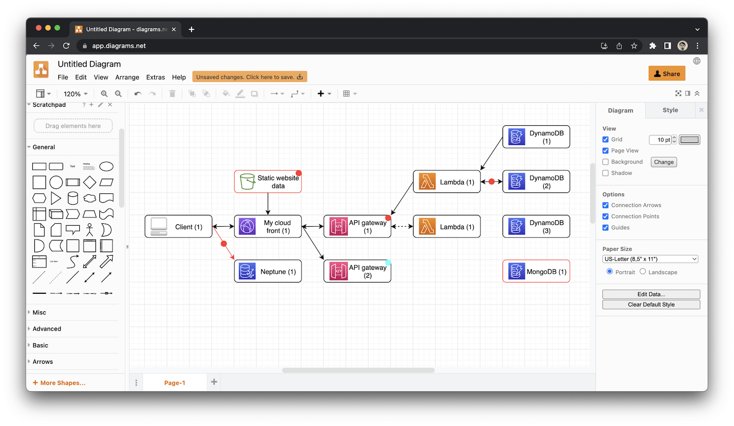
Diagram drawing in a universal interface
Therefore, we created our own composer, which allows us not only to draw rectangles and connect them with arrows but to formally describe the relationships between system components: the direction of data flow; the properties of nodes and connections, complex node hierarchy, etc.
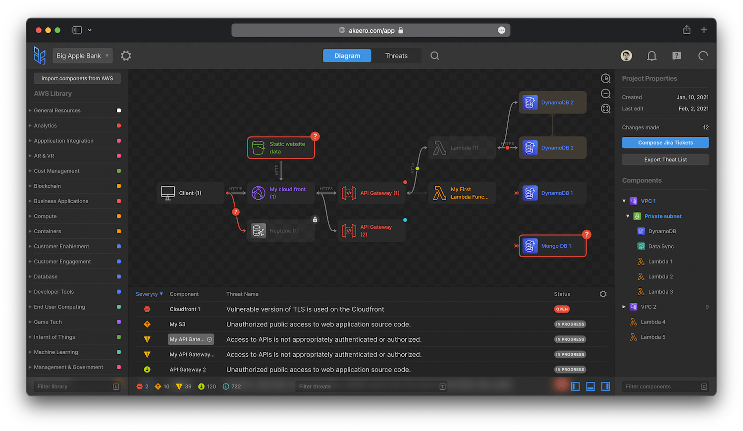
Diagram drawing in the dedicated Akeero interface
Thus, a graphic composer was the primary focus, so we built the entire interface around it and we fine-tuned it to be Akeero-specific. The final results present as a classic IDE—a composer’s canvas (surrounded by auxiliary panels) occupies the central place within the interface.
Building on our own
The market doesn’t have many solutions for building blocks for visual editors in browsers. Some didn’t progress in development. Others didn’t fit our design goals and our performance requirements.
We also had some restrictions. First, the IDE would need to be a collaborative one, which let project teams design their architectures together. Second, we had sophisticated custom-designed elements of our own. Third, architectures typically have a massive amount of internal properties, and it would be great to allow a user to collapse/expand them. Finally, we had to align objects automatically in a readable manner and element overlap (moreover, we had to keep a safe zone around them).

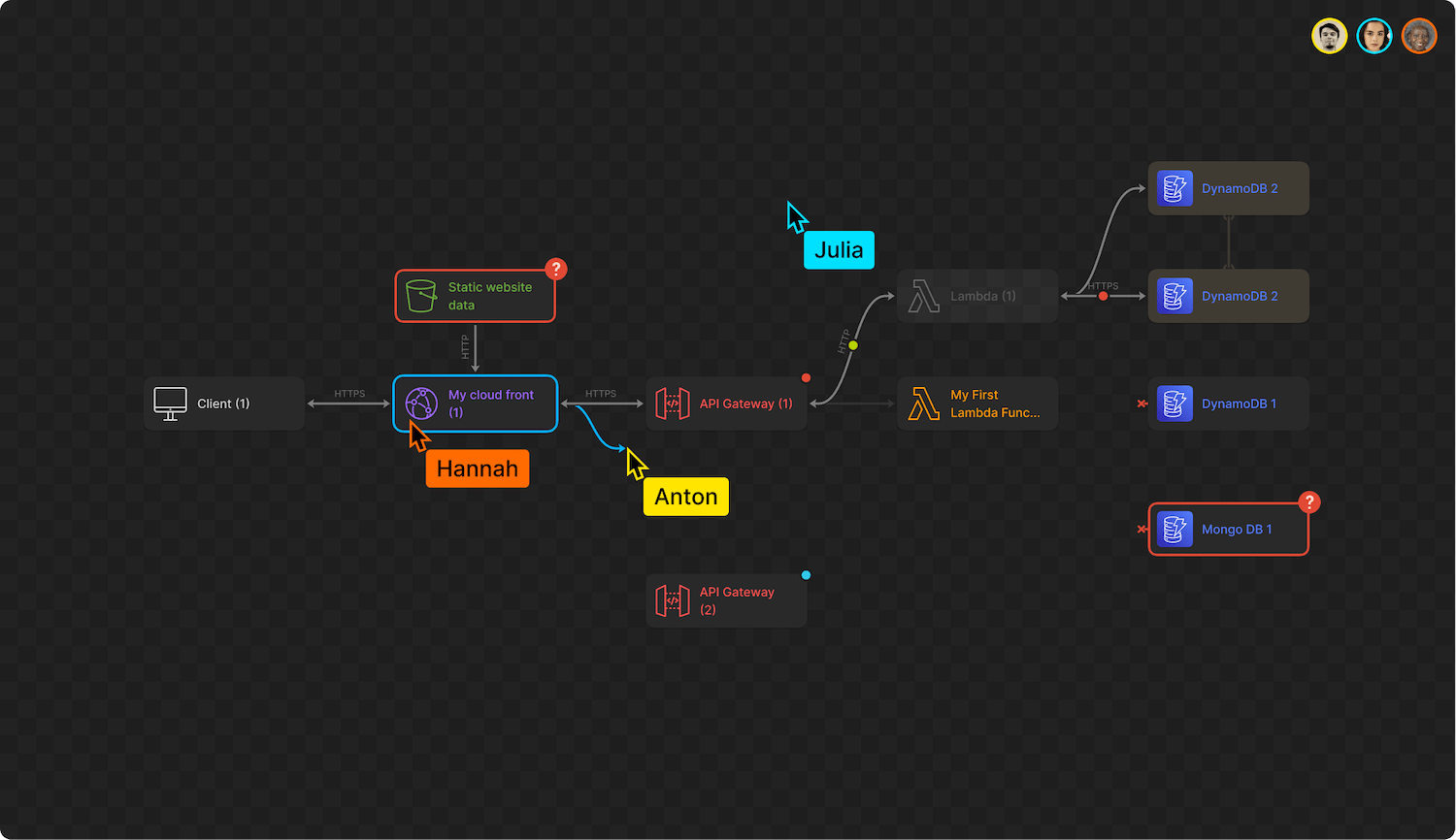
Diagram collaboration in action
After a series of experiments and time spent researching existing solutions, we realized that it would be faster to build almost everything on our own than to refine any existing solution.
A “no-legacy” tech stack
Since we started the project from scratch, we had the chance to experiment with the application architecture. The Akeero team gave us free rein to choose the frontend technologies. These selections included:
- Webpack 5
- React
- Typescript
- Astroturf CSS-in-JS
- CSS Variables and PostCSS infusions for design atomization
- Stylelint and ESLint with our config
- Storybook with Chromatic for visual component testing
- Logux and some other Martian OSS projects (more on them later in the text)
The entire backend and analysis engine was on the client side.
Real-time collaboration with Logux
The next challenging feature was collaborative real-time editing. This was implemented based on the Martian OSS product, Logux.
Logux is a new way to connect clients (web and mobile apps) and servers. Instead of sending HTTP requests (AJAX/REST), it synchronizes the operations log between client, server, and other clients through WebSockets. Building on top of CRDT (conflict-free replicated data type) ideas, it features live updates, an optimistic UI, and is offline-first by design.
Using the Akeero application, users don’t need to wait for a server response for every user activity. All of the numerous architecture models that users might build locally on their computers (and any changes) must be seamlessly synchronized with the service in real-time.
In theory, one can just send AJAX in the background—but in actual practice, this could be tricky to deal with at times. For example, if two people are editing something in parallel, they may change things in different orders. And they can also build different diagrams. Or, perhaps some other interference occurs: for instance, changes are unable to be saved because of a server error, or the service suddenly goes offline.
If you want a ready-made solution, Logux provides it. It allows data synchronization even in complex cases, it resolves conflicts and solves “offline” problems.
Logux refining
Initially, the Akeero team explored other solutions like Apollo, AppSync (Amazon’s GraphQL extension) with Amplify DataStore (a state manager on top of GraphQL with conflict resolution and offline). But Amplify DataStore was brand new and didn’t get much documentation and its size was 10 times more than we could afford. Further, in this case, serverless WebSockets didn’t work and would have been extremely complicated for our needs.
But thanks to this project, Logux evolved to meet the challenge. We implemented the capability to transport Logux actions to REST requests, improved sync channels for Logux Server—and halved the number of dependencies in the project as a result.
A typical AJAX architecture is not designed for real-time UI. When users work with an application, a request to change the model might be sent before the server responds that everything has successfully been saved. In some applications, loaders solve the problem, but at the cost of imposing some speed limitations. To eliminate this problem, the Evil Martians team had to duplicate some of the backend logic on the frontend side to provide an optimistic UI. At the same time, we implemented the option to roll back changes if the server sends an incorrect response. Incidentally, this feature is built into Logux for many cases.
In the end, a sense of symbiosis was achieved: Logux fit the existing structure and tasks perfectly, and with the Pro version—Logux Server Pro—which supports scalability—the service could scale fast under increasing loads.
Using more Martian open source
In addition to Logux, we used some other Martian OSS frontend projects with Akeero, too.
The logic of the UI was built on Nano Stores. In frontend projects, all of the logic is typically described using React components. As a result, it isn’t easy to write tests since they need to emulate the entire browser. In our case, the business logic was described abstractly in the form of many stores. So to test the logic, we needed to write pure JS code; these tests worked fast and were easily written. We managed to cover 100% of the stores’ code with tests. React components simply rendered store states, and since they contained very little logic themselves, we were able to test them using screenshots via the Storybook service. As a result, because of Nano Stores, we quickly covered the entire application with tests, which helped to prepare the MVP on a tight schedule.
We also used the popular Autoprefixer, Browserslist, and PostCSS projects. However, we could safely suppose that nearly every web project utilizes these (including your own!), so let’s not dwell on them now.
An SVG-based composer
There are three ways to describe page elements in the browser: via Canvas, HTML, or SVG. We can immediately note that Canvas had too much code overhead and did not fit our purposes. The benefit of HTML comes from the fact that it offers many flexible layout elements. We can just set the block order and they’ll automagically appear as they should. The downside is that HTML is quite slow here. Still, we explored this option for a bit. Ultimately, we realized that the speed drop would be prohibitive due to the significant amount of elements our application would need to work with. To contrast, SVG elements are easier (and faster) for the browser to render—and you can create a lot more of them, too.
We initially wrote the diagram composer with two layers—an HTML layer and an SVG layer with components for interacting with the architectural diagram that a user has created—to move connections, create a new connection, and so on. Then, the Akeero team assigned us a task to export the diagram as an SVG (this was in addition to other export formats; SVG as a vector format is often used for presentation purposes—for showcasing on large screens, printed posters, and so on). To support the feature and increase the rendering speed, we migrated the entire composer to SVG.
Along the way, we had to solve the following problem: while the browser was a cutting-edge instrument, the SVG viewers embedded into operating systems were outdated. And we had to write some code to automatically polyfill part of the SVG code.
Batching
When users edit an architecture’s schema, we must accumulate changes first, store them, and transfer them to a framework—React in our case—for rendering. Typically, in a framework, each component is updated on its own. So when a user selects 5000 nodes and moves them 10 pixels to the right, 5000 messages will come to React, it will redraw elements 5000 times, and this is extremely slow.
Solving this problem required batching—a mechanism that allows combining data and setting conditions: for example, rendering every 200 seconds or once in each rendering cycle. We gave the Akeero team several implementation options. The first (which they ultimately selected) was migrating to React 18, which has built-in rendering batching by default. Now, when the framework gets 5000 render requests, they can be grouped and rendered altogether. The browser has moments for rendering, and in between these moments, React groups events.
We also eliminated some problems with additional abstractions and implemented batching in our Logux State Manager (we built it specifically for this purpose).
With Logux State Manager, we use the event delivery channel, or, more precisely, the log—a list of events that are synchronized between the client and the server automatically. That’s why we can easily find which events we need to synchronize.
Auto layout
This feature allows a user to place elements into a diagram in any order, then we run the code, and it automatically arranges them. We researched many frontend libraries to implement it, considering those that fit our restrictions—the nested groups and the physical size of the nodes. The latter is an essential consideration because many automatic aligners simply align all the circles to be of the same size.
We opted for a library that allowed us to simply implement the desired feature on the server-side—Cytoscape.js (a big library for graph drawing with multiple layouts) and we used BFS in tandem with Cola layout. We integrated them on the Logux backend, implementing them with a bit of sophistication, running the elements through two algorithms to visually improve alignment within diagrams.
Optimizations in the project
In the process of working on this project, we had a lot of optimization to do. Here are some of the areas where that came into play.
Mock it!
Since we needed to deliver an MVP on a tight schedule, we couldn’t wait for the backend work to be completed before beginning to implement our frontend ideas. Therefore, we worked simultaneously with the backend team and created 3 working areas: frontend, Logux server (or frontend for backend), and backend. So when the backend part was ready, we didn’t have to rebuild the frontend to match it, and we solved all integration tasks in the Logux server.
We mocked up the local server and API to check frontend operation and we were able to immediately demonstrate the implemented features to the customer. The mock up saved time for the development of the additional features.
Lightweight frontend
We wanted to ensure that the fronted code had a minimal data footprint. We ended up with a JS bundle with a minimum size of 315 KB (no gzip) and a maximum of 540 KB (no gzip). This is about 10 times less than the industry average as typical projects can reach up to 2 MB of JS files. This file size reduces the browser freeze when the application starts and works great to increase the app’s speed.
Here are some things that made that possible: first, we didn’t just use the first applicable libraries we came across. Even if they technically fit our needs, most of them were still poor in quality, so the benefit to development speed comes at the cost of reduced UX quality, development agility, and performance. We rigorously reviewed all possible alternatives, only adopting them if they met our criteria.
Second, we were trying to fight the typical frontend industry disease where instead of developing a solution, teams tend to create a Frankenstein’s monster composed of numerous ready-made components. In theory, this should speed up engineering time, but in actual practice, only at the project’s start. That’s because teams will quickly realize that they don’t have enough flexibility, and because they’ve used so many modules built by other people, they have a lack of understanding of the overall engineering architecture. As a result, development starts to slow down after a month or two. Therefore, we weren’t afraid to write code on our own, and this meant we knew all the code that we used in the application. A slower start, but we didn’t have any slowdown later because we had complete control of the codebase.
Third, we had a performance budget from the very beginning. Whenever the size of the JS assembly grew, our engineers had to update the budget—and this requirement made us think twice before letting the size increase. We budgeted the size of the JS files and the project using our own Size Limit OSS project.
Finally, we applied the same stringent requirements to our solutions as well. Logux and Nano Stores are very compact libraries, and unlike some modern solutions, they will not include code that won’t be used in the JS bundle (due to API design). For instance, we were deciding between Logux and the socket solution from AWS in the beginning. But the solution from AWS weighed 100 KB, and Logux—9 KB. This was a clear choice.
Favicons
We also dealt with favicons as part of this project. We collected a minimal favicon set that worked great in all browsers: /favicon.ico with 48px to be compatible with everything, and different sizes (thanks to SVG) with /icon.hash.svg for modern browsers. SVG also let us design a dark/light icon theme through media expressions: /apple-app-icon.hash.png for iOS, /icon-192.hash.png and /icon-512.hash.png with manifest for PWA.
Martian design system
Akeero was one of the first projects where we utilized the Martian design system, which made our frontenders’ lives much easier. For instance, fonts are given a fractional size to fit into the grid. Also, we used a clearly defined indentation system everywhere so that the frontend engineers didn’t measure everything manually. The engineers knew where and what the distance was above and below, and this helped matters in a big way.

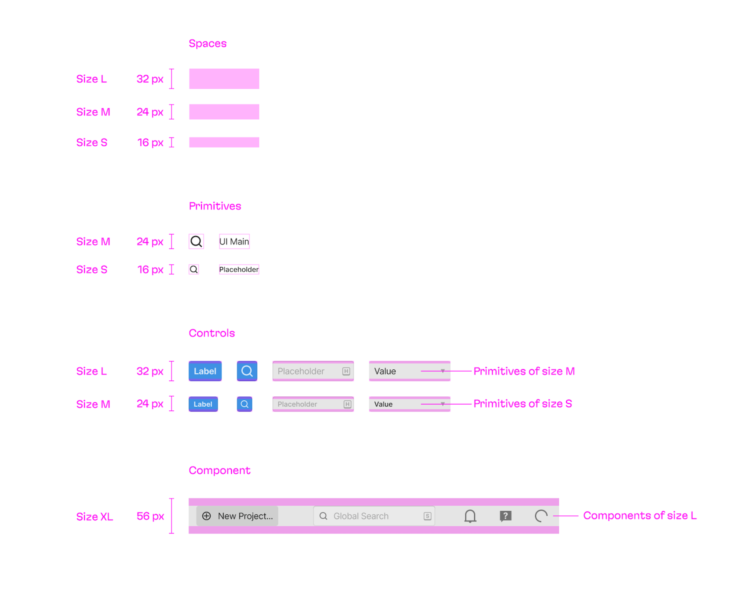
Basics of the Martian Design System
As a result, when our designer had finished his part of the work, the Martian frontend engineers could add the missing interfaces from the pre-made pieces independently.
MVP in 4 months
In a rather short time—4 months—we managed to nail a complex task and helped release the product’s first version, with a working diagram composer and other features. CRDT and professional UI design made collaborative work smooth and convenient in real-time. Here is how it looks in action:
After the public release, the application picked up its first real-life users, and the Akeero team continues to develop the product on their own.
We’re ready to discuss your needs in building a developer tool at any stage of development—from MVP to critical feature releases. Contact us to learn about what our experience and skills in this area can do for you!