Midjourney vs. human illustrators II: more Martians join the battle!


Recently, Evil Martians team members from various disciplines have tried to make friends with Midjourney: frontend and backend engineers, product designers, and even some of our colleagues who would otherwise never touch it. We’ve used it to try and complete one of our regular image creation tasks. So, did it work?
Other parts:
- Midjourney vs. human illustrators: has AI already won?
- Midjourney vs. human illustrators II: more Martians join the battle!
Nearly a year ago, at the end of our previous article “Midjourney vs. human illustrators”, we revealed that the post had actually been written with AI assistance. At that time, this actually elicited legitimately shocked responses from some people! But these days, readers probably wouldn’t bat an eyelash at this kind of “revelation”.
To say a lot has changed in the world of image-related AI this past year would be an understatement.
For instance, Midjourney itself has also been updated multiple times, and notable tools like Bard, Firefly, and Generative Fill from Adobe have come onto the scene, and, at the time of writing, the ChatGPT browser service’s DALL-E 3 integration has just entered beta. (Things are going so quickly, this article may even feel dated the moment we publish it; seriously, Midjourney just pushed a major new feature out last week.)
But anyway, this isn’t some hardcore Midjourney prompt-crafting article. Instead, it’s more about bearing witness to an emerging field, and seeing how a team is experimenting with moves into that field (while maintaining their humanity and eye for quality as much as possible). After all, it seems increasingly possible that, in the near future, generative-AI skills may just be an assumed tool in the tech professional’s skillset.
Now, if you didn’t read the previous article, some background: ideally, each post on our blog has a unique illustration to match its content. This is a task we must do with our human illustrators on a regular basis, and we’ll stick to that same task here, too.
This time, we’ll have a different sort of battle: will our diverse range of professionals (with varying degrees of Midjourney-familiarity) be able to generate satisfactory illustrations? Or is there still just no substitute for real human creativity?
Let the battle begin:
- We’ll analyze our Midjourney illustration-creation attempts from a diverse selection of our colleagues: engineers, designers, and more.
- As a counterpoint for team human, we’ll also try to reverse-engineer some seemingly simple human-created illustrations using Midjourney.
- Finally, we’ll offer our insights and Midjourney quickstart tips for your team members whose work doesn’t involve graphic illustration skills (or for uninitiated professionals from any field).
Product designer Yaroslav Lozhkin tangles twice with Midjourney
Yaroslav had written a post about troubleshooting common UI design problems for decentralized applications and needed a blog illustration for his article. His Midjourney prompts related to the idea of a Martian interacting with some kind of futuristic interface.
He tried a number of prompts, and we see some variations here: sometimes without a character, and sometimes with the character really emphasized. At this stage, he also needed to consider how close the results should try to approximate the typical style for our blog illustrations (some of the options below are pretty far off from what we’d normally publish).

In particular, we wondered if it was worth trying to keep the martian character at all because the designs did skew pretty far from the kind we’ve historically published. Team feedback was important at this stage.
From there, he began to hone in on an abstract composition, literally resembling a black mirror, which we thought fit quite well with the blockchain theme.
Next, it was time to smash that remix button until a suitable result was found. Ultimately, we ended up with what you see below, and, after trying out a few more variants and performing some image modifications to our final choice, it was published alongside its corresponding article:

This was a success for Yaroslav–and the final result was pretty cool indeed. But there was also another attempt that didn’t quite make the grade…
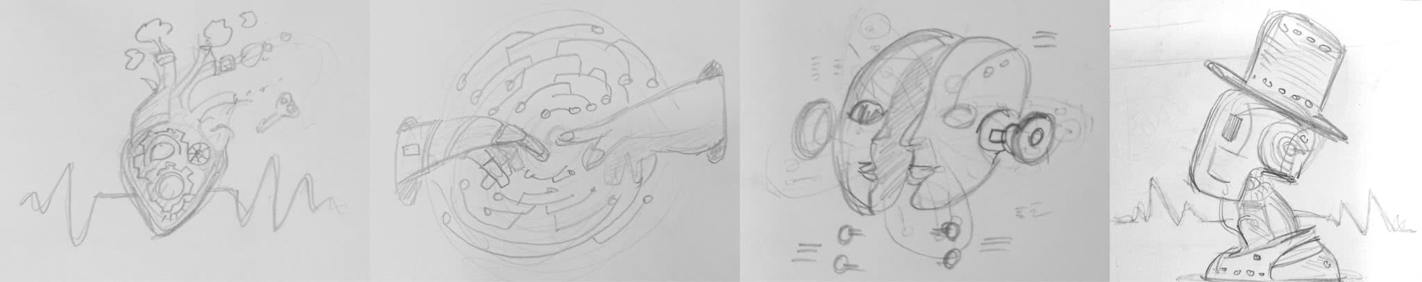
Some context: Yaroslav had also written an article about helping businesses leverage AI solutions. Initially, we worked with the concept of a robot as some kind of conductor alongside an orchestra, and started to brainstorm with Midjourney:
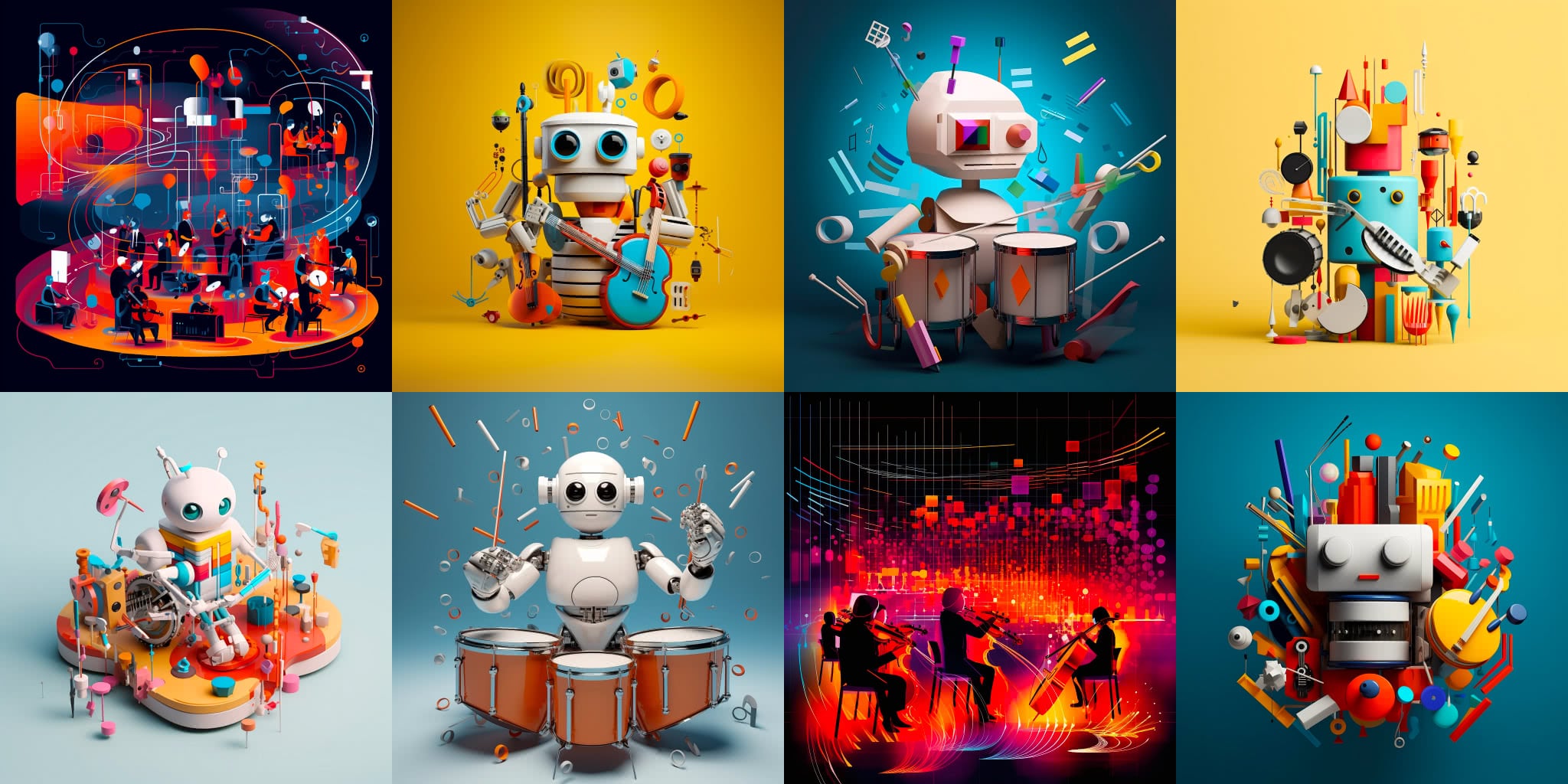
In practice, however, using the robot as the central idea felt too direct, cliché, and something just wasn’t resonating like we’d hoped. We’ll spare you the details, but, trying to wring some positive ideas out of this was becoming time-consuming, and despite multiple attempts, the results simply weren’t satisfying.
It was time for a human to help! We decided to work with one of our talented flesh-and-blood illustrators, and they suggested some compelling ideas within a few days (some of which were in directions we probably wouldn’t have thought of on our own).

In the end, the result we ended up with was quite different from our concepts. As you see on by visting the live article, the illustrator was able to spice up a relatively simple concept by animating it. Creating a satisfactory animation ourselves probably would’ve been a lot more time consuming using pre-existing AI solutions (although that world is rapidly progressing, too).

Takeaway: a strong initial concept is essential for getting a positive result. Midjourney is definitely useful as a brainstorming tool, but (in many cases) it just can’t replace a human bringing their ideas to the table. In the first case, where Yaroslav brought a more solid concept to the table upfront, he reported quite a bit more satisfaction with the experience.
Midjourney and Victoria Melnikova, head of business development: a starry result
Victoria Melnikova, our head of business development, had written an article on monetizing open source. The initial concept for its illustration leaned heavily into how GitHub star statistics related to her text.
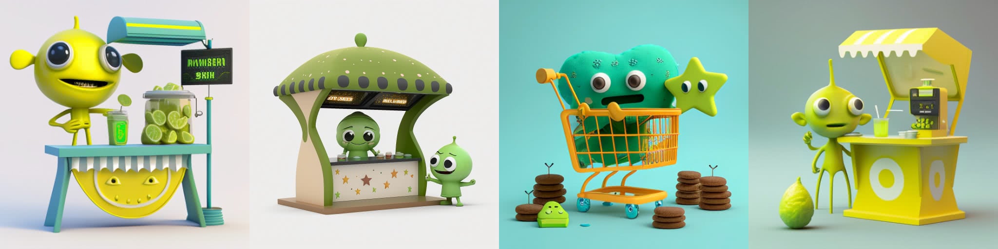
The original idea was to have a martian character selling something at a kiosk (perhaps a salesmartian would be showing off stars there).
This first set of iterations focused directly on the original concept. You can see that, at times, the results veered off into styles that we simply never use, like classic 2D animation. We tried for a long time to get a result that matched the original concept, but, even if some were quite cute, it was a real challenge to find a character who hadn’t fallen deep into the uncanny valley, or who didn’t appear to be a resident of some sad island of Pixar rejects.
The results were also not really generating the kind of emphasis on “stars” that we’d hoped, considering their prominent place in the article’s text.

Incidentally, we also had a set of iterations around starships, and although they didn’t really fit the theme, we’ll share them just to show how quickly Midjourney can help you brainstorm in a totally different direction.
With neither solution clicking, we decided to go back to the drawing board, and we returned to a simple idea: stars. So, we tried to render a glass jar of stars.
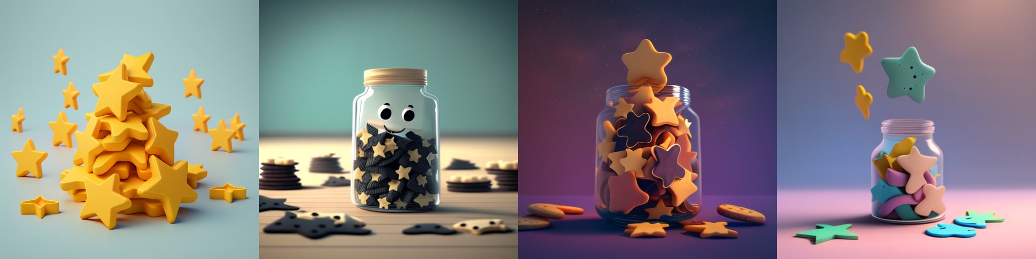
The result was effective, and we liked it. (By the way–a team member was surprised to learn that this image was actually generated by Midjourney, so that’s pretty cool, even though this concept ended up quite far from our original goal!)

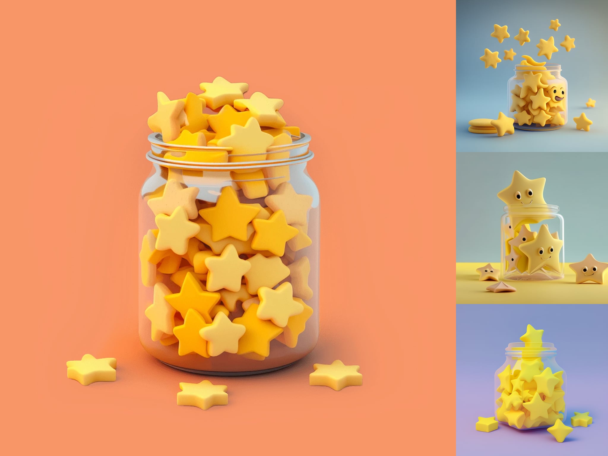
Takeaway: Initially, we were really fixated on the idea of a lemonade stand as a metaphor for commercial open source, however, after a few hours of work, that just wasn’t clicking. So, after a couple of days off, another attempt was made, this time with a goal: create this image in one hour. The concept was formed, and boom, in 30 minutes, we had our result.
Sometimes a simple concept (like a still image instead of a dynamic scene, or something with characters) can make generating a suitable result easier and faster.
Principal backend engineer Vladimir Dementyev gives Midjourney a go
Vladimir Dementev had quickly written up an article about Ruby Bytes and needed an equally quick illustration if he planned to meet his publication deadline. So, working with a human illustrator would’ve been quite impossible.
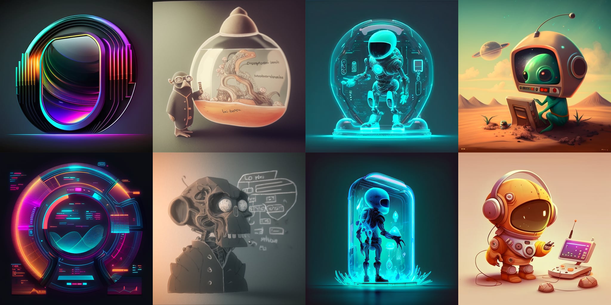
For this illustration, he simply wanted to have a martian character interacting with a Ruby in some way. Sadly, after consulting with several team members, we felt every draft appeared quite strange. The design of the martians didn’t match our typical characters, and the form of the Ruby was atypical, too (there is a very particular and recognizable Ruby shape associated with the Ruby language).
While the results were still technically impressive, we felt the characterization and overall result did match what we wanted. In the end, we decided to publish this article without an illustration at all, rather than have an illustration we were unhappy with.
Takeaway: In our case, some quick articles don’t necessarily need illustrations. While we weren’t able to find a suitable result with Midjourney this time, it’s still nice to know it’s in our toolkit, so we can at least try to get something when we have a short deadline. Maybe next time!
Multiple Martians team up with Midjourney for a frontend article
Martian frontend engineer Ivan Buryak was working on an article and reached out to our product designer Yaroslav Lozhkin to take the lead on generating a cover. Since the article dealt with the concept of pitfalls related to asynchronous code, the concept of “broken clocks” emerged. This time, blog editor Travis Turner acted as a stakeholder for the illustration.
Communicating as a unit, the concept of broken clocks as a visual metaphor for asynchronous-programming-related problems emerged, and within just two hours, a series of potential icon designs were produced.
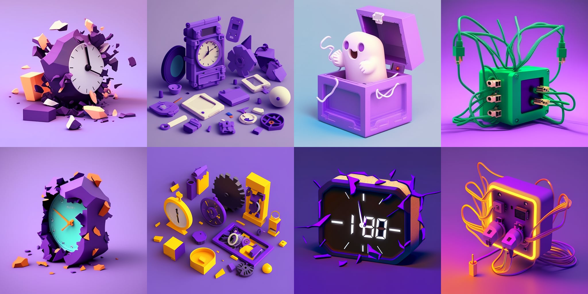
From the “brainstormed” Midjourney concepts, Ivan and Travis selected their primary preference:
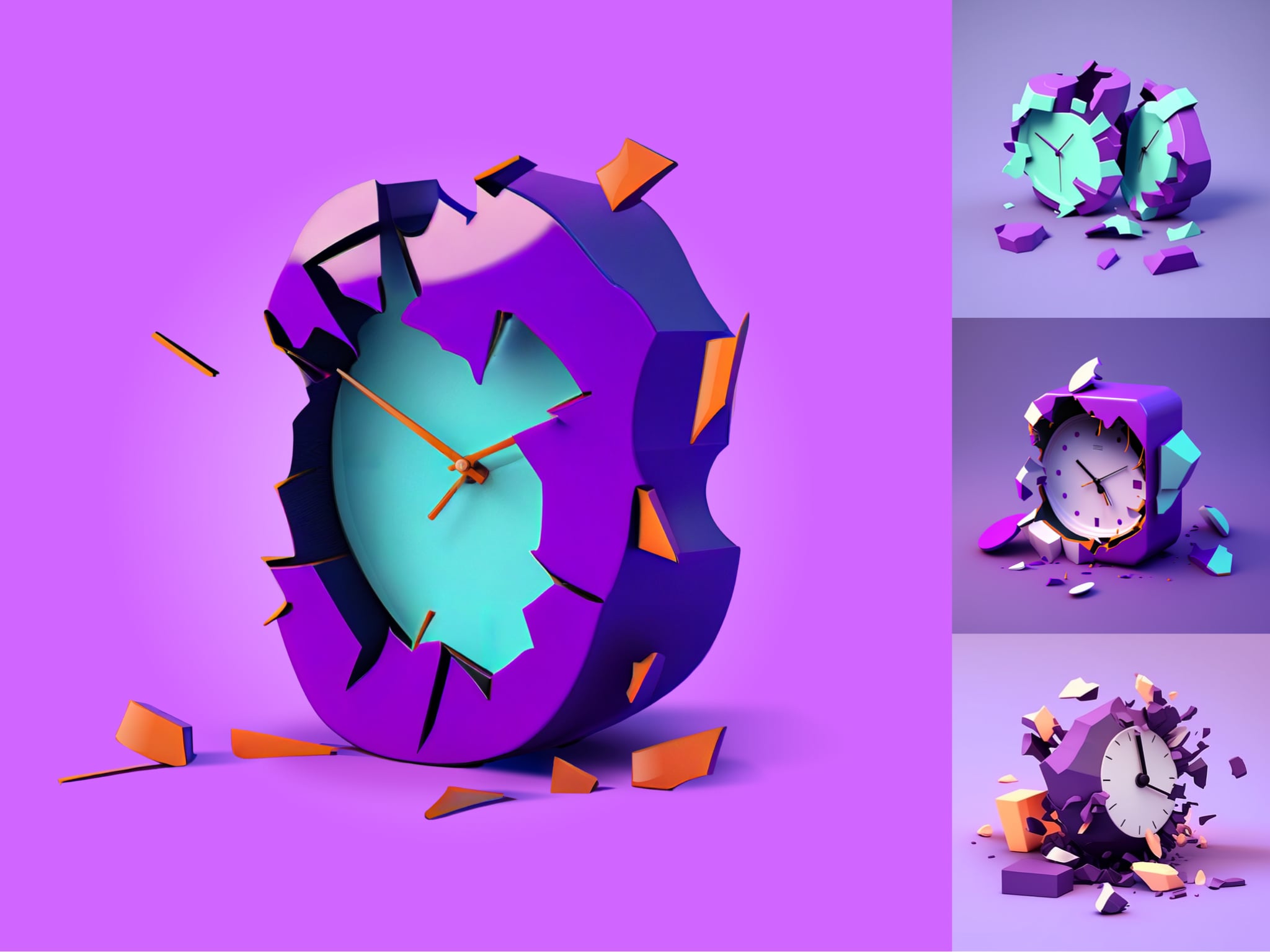
We could’ve certainly gone deeper and experimented with different prompts, but, in this case, the chosen design had already achieved the desired balance of effectiveness and efficiency.
Takeaway: Here, we again see a key guideline in practice: the importance of having a clear direction early on for generating a quick, effective result. It’s essential to establish core ideas and themes as soon as possible to act as a guide.
Midjourney and head of design Roman Shamin: Midjourney fails to take off
The goal here was to spend 10-20 minutes to get an illustration for Roman’s article “design first, build later”.
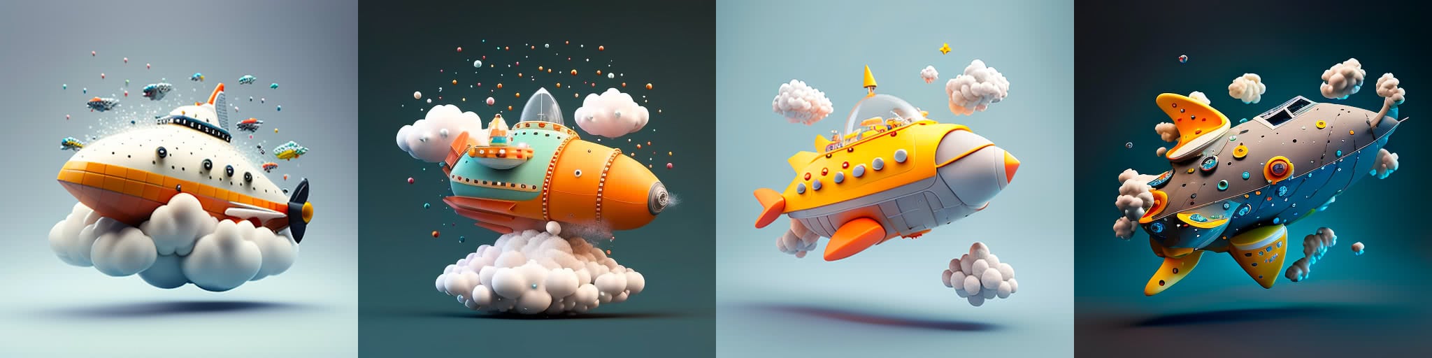
He attempted to convey the image of an airplane being assembled mid-flight. After several unsuccessful attempts, this idea morphed into “an aircraft or spaceship built from distinguishable parts.” He also experimented with abstract prompts to illustrate the concept of assembly in various ways. However, there were “issues”, and he was getting off-base results:

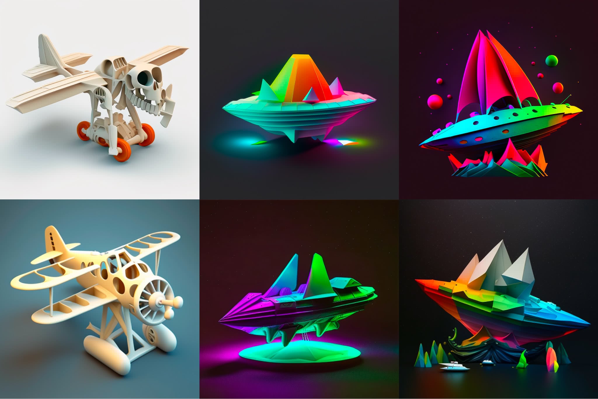
These were all just too far from his vision, despite quite a bit of re-prompt-ification. In the end, with a deadline approaching, Roman decided to abandon this attempt to use Midjourney altogether, and ended up creating his illustration by hand:
Roman actually reported that he spent a couple of hours working with different approaches to try to get a satisfactory result. This was much longer than initially expected. For now, he’d prefer not to use Midjourney in the future unless absolutely necessary to get a quick result. (That being said, he was unaware that a reference image could be used for a prompt, so that could leave the door open in the future.)
Takeaway: Be mindful of the amount of time you’re spending with this tool. It’s easy to get carried away, and can actually be a little bit addictive in some ways. In Roman’s case, he knew when it was time to eject in order to meet the deadline with a result that better matched his vision.
Product designer Gleb Stroganov and the white whale of Midjourney illustrations
The concept for Gleb’s article was related to customizing icon designs to more closely match fonts. So, the final result would need to fit in with this concept somehow. The first idea was to show the morphing and transformation nature of a letter. The quality of images was good, but with no clear winner. Additionally, they all sort of suffer from an obvious “AI look”. That is, the complexity of the illustrations is far beyond that which our illustrators normally produce.

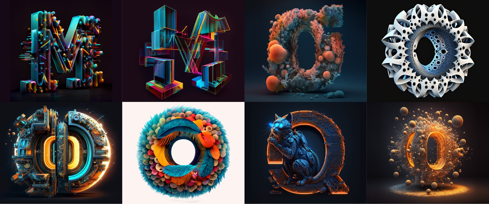
And another thing–these designs were all about the font aspect of the article. But really, shouldn’t they be about the “icon” part? That was intended to be the focus, at least, customizing icons based on fonts. Since an icon design with an arrow was featured prominently in the article, the next batch of brainstorming concepts would pivot to this:

Fair enough. But back to those fonts–is it possible to somehow combine the idea of the “icon” and the “font” to try and capture the full picture of the article’s concept? We could certainly try.
Well, perhaps not–it seems the font/icon combination didn’t quite work out. There is a brutal, “Game of Thrones”-look here. Perhaps it was time to go back to the drawing board, so Gleb did. He stepped away from Midjourney completely, and decided to assemble some elements from the article itself in a collage style.

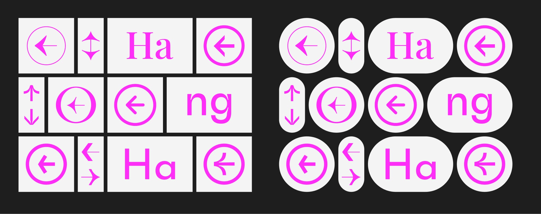
It wasn’t so interesting, but there is certainly some kind of appeal here. (By the way, trying to use these images as source images for Midjourney was also fruitless.)
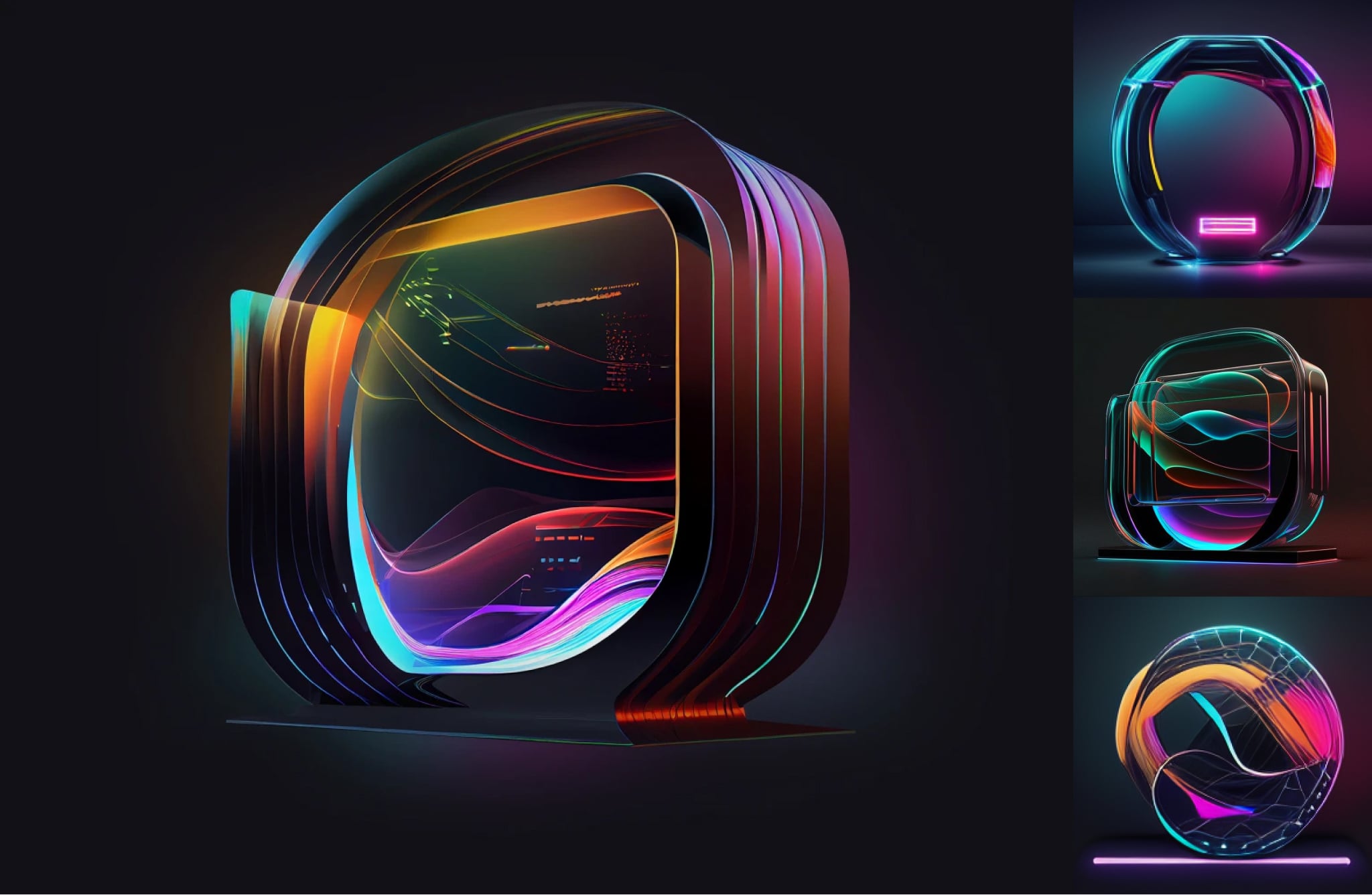
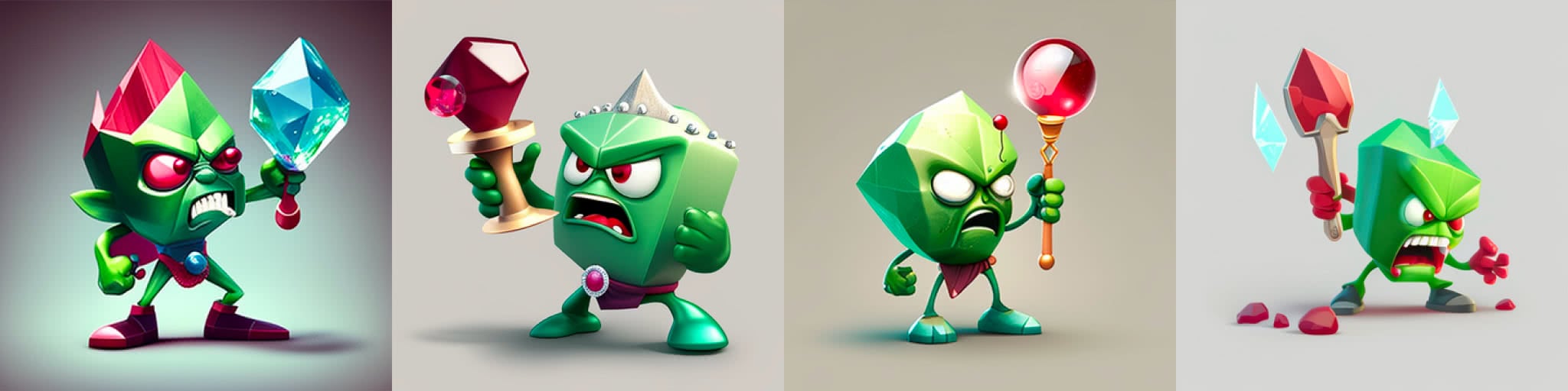
Then, Gleb was able to conceptualize a concept that really resonated with his vision for the article. Back to a more “abstract” idea of an icon, and again we have the arrow, but this time, composed from some crystal material, dynamic, with a stainless effect, and space/ambient vibes.
There were tons of iterations on this concept. He knew he wanted something like this, but finding the fitting variant was just a matter of some slight prompt adjustments and patience.

We finally had a result that we felt communicated the idea of “icon transcendence”, and it avoided that messy, overly-complicated “AI-generated” look.
Trying to reverse engineer our human-made illustrations with Midjourney
We’ve certainly shown some cases where Midjourney’s results satisfied us, but on the flip side, we’ve also published a few articles that were created by human illustrators that we think would’ve been more or less impossible for the present iteration of Midjourney to render. Let’s take a look at just two of those and elaborate on why we feel that impossibility exists.
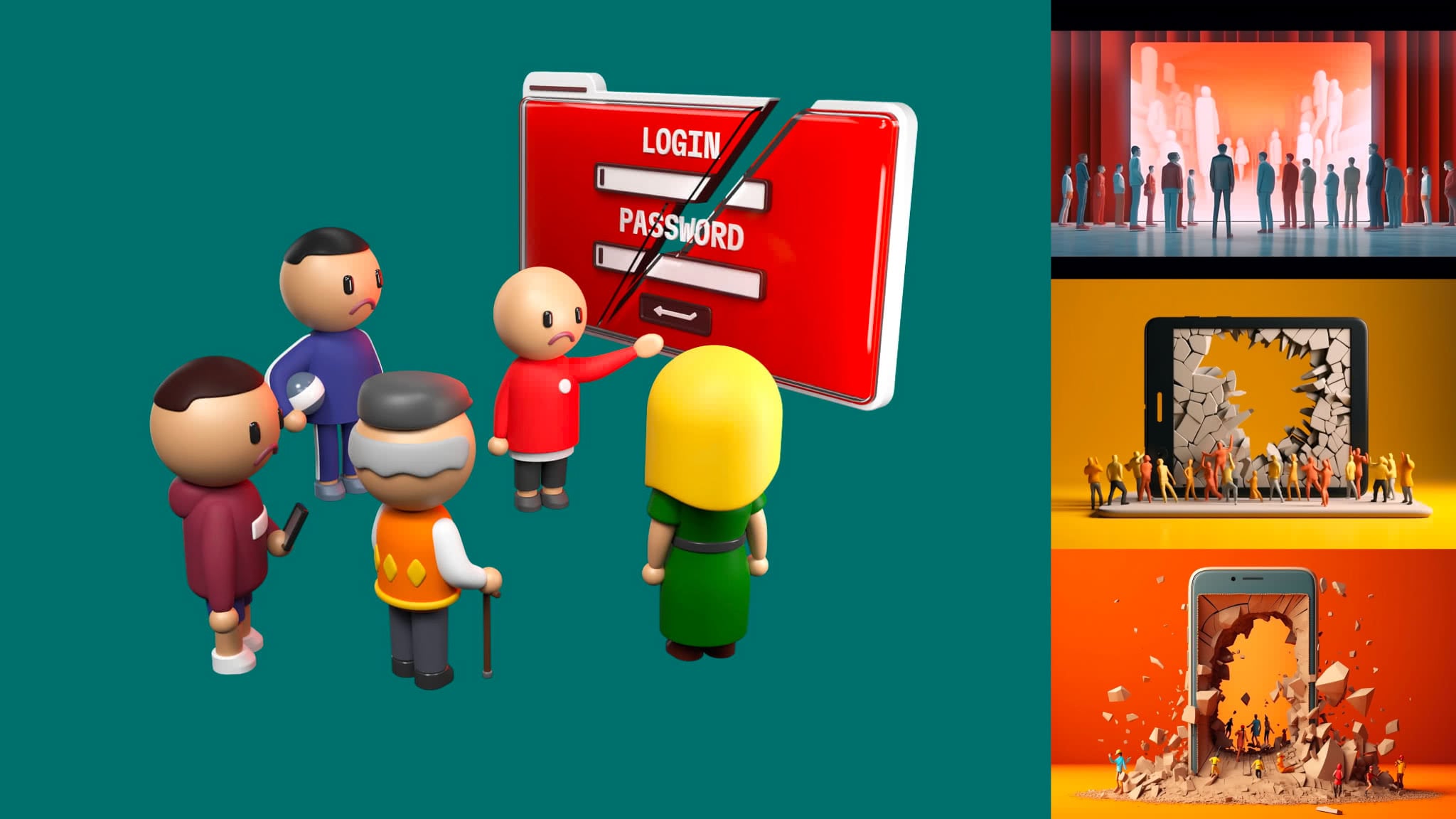
In this first case, Martian principal frontend engineer and PostCSS creator Andrey Sitnik wanted an article about best practices for HTML forms. The final result is on the left, and our attempts to recreate the prompt are on the right. Despite the deliberately simple style of our human-made illustration, it’s highly unlikely Midjourney would’ve been able to even halfway approximate what we were after.
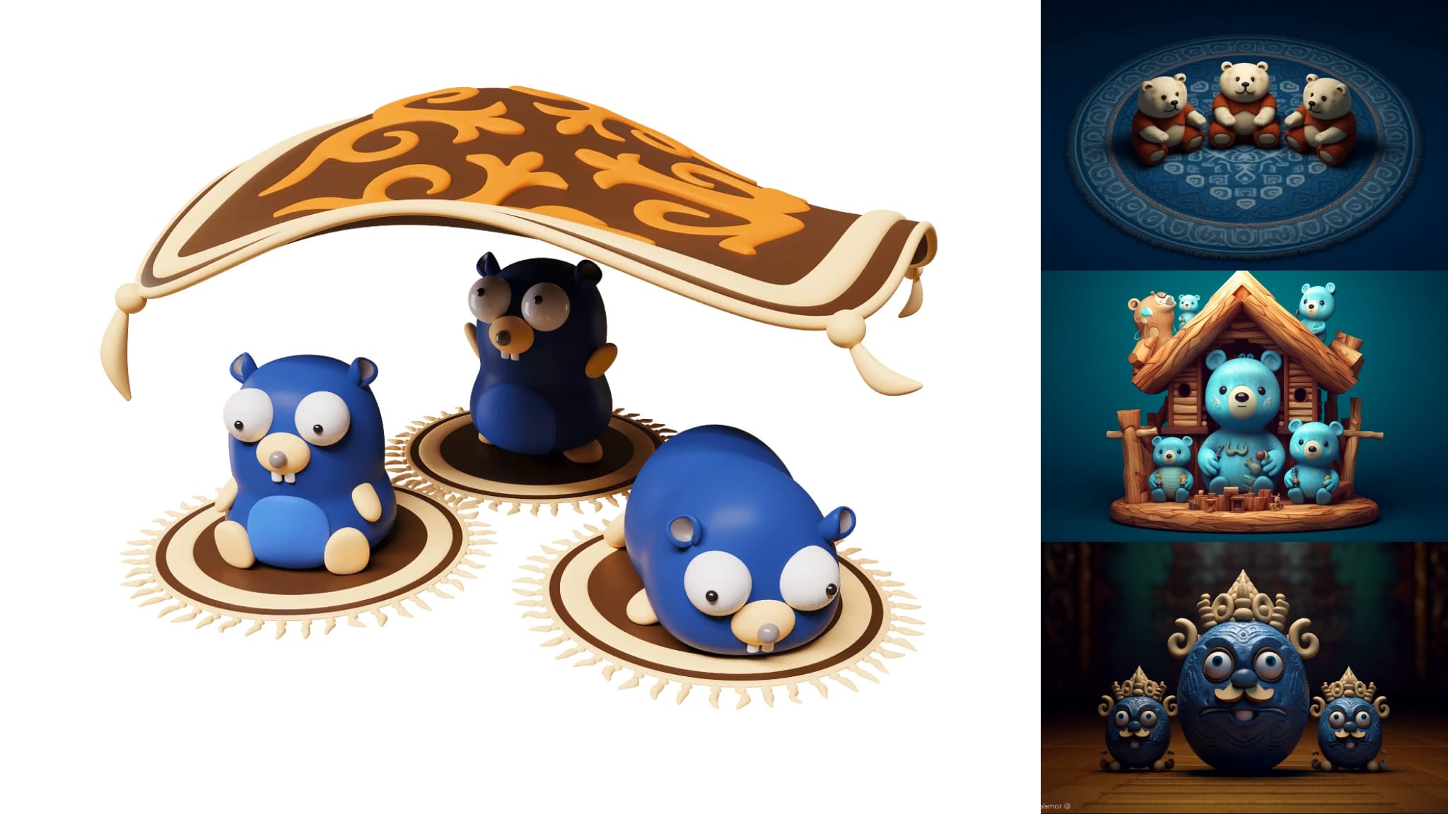
In a second case, Vladimir Dementyev had another article with an illustration featuring multiple iterations of the mascot of the Go programming language. Good luck getting Midjourney to produce duplicates of the same character like that, let alone in a specific scene. Perhaps it would be possible for a talented Midjourney practitioner to do something close, but the time to produce such a result has to be taken into account. Again, the final result on the left, our attempts to recreate the human-made illustration via Midjourney on the right.
A Midjourney checklist if you decide to give a similar task a try
Based on our experience, we’ve started to formulate a series of guidelines that pretty much anyone can use when creating a cover for a blog, or some similar image.
- First of all, you need to have some kind of basic concept. What is your article about? Or, what will the image accompany?
- If you’re dealing with an article, having a title can be super helpful. It’s always a good feeling when a title and an illustration are in sync.
- Know your style. If you suddenly start producing images that look super “AI” or something obviously generated by Midjourney, it’s not ideal. This is a tool, and any tool requires some level of craftsmanship if you want to strive for better results.
- If you know the content of the article, this can guide you, too.
When starting out, whether you have a strong concept of not, consider playing with no requirements of restrictions. The first prompts can be simple iterations of your ideas. Get some vibes going, and run with them. There’s no need to go into the details (technical or otherwise) at this stage. Instead, try to get a feel for an idea that the AI can help you with, instead of dragging you off course.
Probe for ideas. With Midjourney, you can always try again. If a particular variant catches your eye, unleash your inner explorer and chase the magic!
Not quite “the singularity”
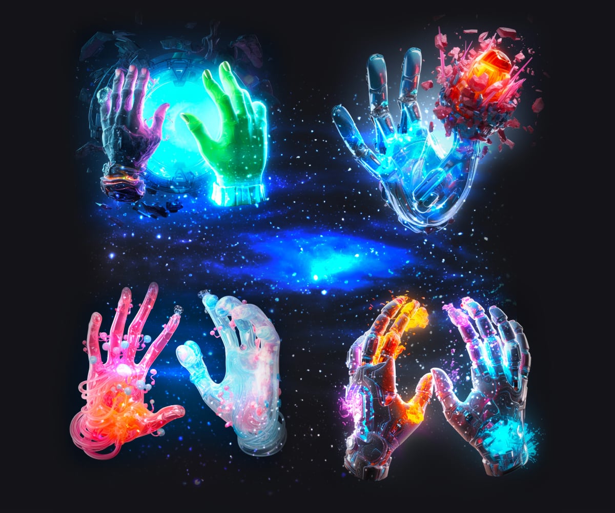
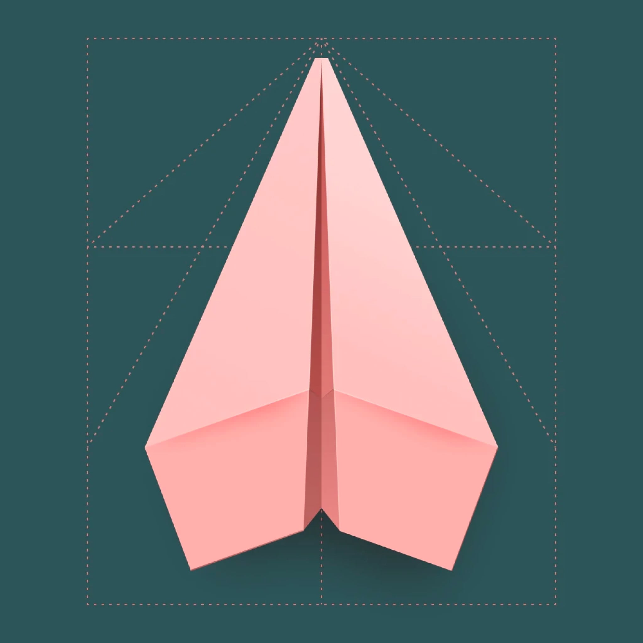
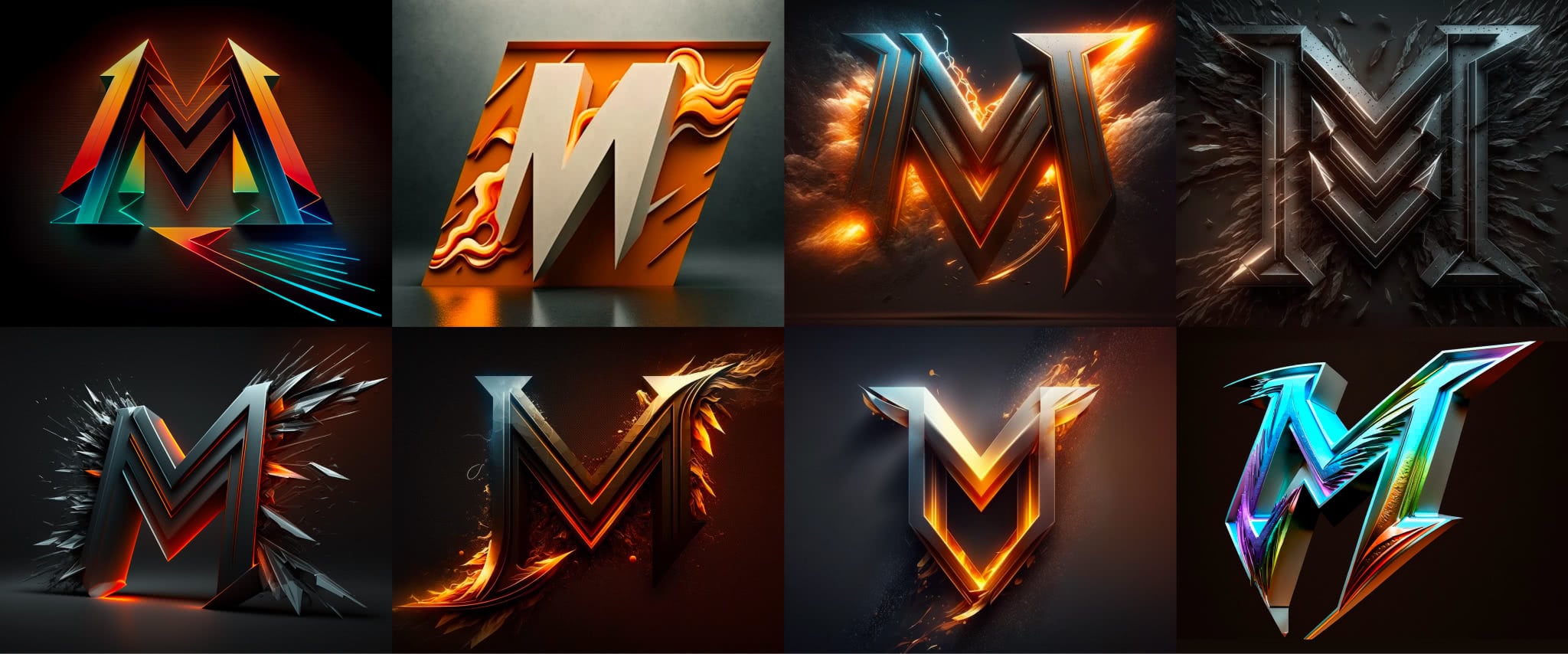
One more thing, what about humans really, really working together with Midjourney? Did you notice the cover illustration of this blog? Let’s take another look.

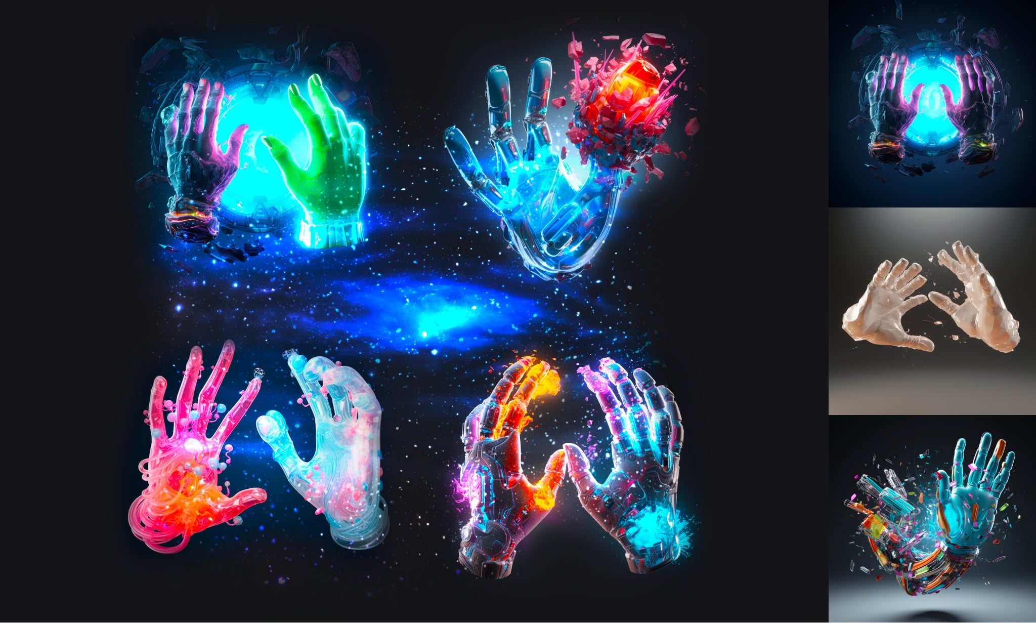
Of course, these 4 were obviously generated by Midjourney, but then chopped together, and further modifications were also made using Photoshop AI, and a little more human touch was applied as well.
It’s going to be interesting to see how multiple AI tools, along with human soul, continue to develop this field.
Rounding up the second round
So, has “AI won”? Well, really, no. The fact is, we’re just not fighting anymore. We’re trying to make this relationship work. But as far as actually incorporating Midjourney as a multidisciplinary tool across our team, there have been transcendent highs and utterly brutal lows, growing pains, wasted hours, and times when you just have to walk away and cool off.
One thing seems pretty clear, despite any controversies, this tool is fun to work with! It’s going to be exciting to see how things are shaping up by the next time we check in!

At Evil Martians, we transform growth-stage startups into unicorns, build developer tools, and create open source products. If you’re ready to engage warp drive, give us a shout!